Place-Making with Rachel Hodson
Art
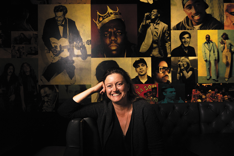
Designer Rachel Hodson strolls down 300 South in downtown Salt Lake City during golden hour. She stops to point out how the light filters through the busy dinner service at Copper Onion. She notes the planters, the rafter; brushes her hands against the door pulls, the Parisian tabletops. These are details that Hodson recalls easily because she scouted each of them by hand, pulling from flea markets in New York City or enlisting local makers and craftspeople. Hodson’s impressive body of interiors, many of which happen to be located on the same block, are a collective sweet spot of historic renewal.
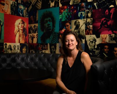
The intimate Copper Common patio, the cool bar, cozy waiting area at Salt Lake Film Society and the graphic punch of Good Grammar (a collaboration with Kelly Schaefer)—these are hallmarks of Hodson’s hands-on approach to her craft. Though the interiors of these spaces were envisioned and brought to life by Hodson, the term “designer” (or “interior designer”) doesn’t fully align with the ethos of her work. “I think of what I do as place-making,” she says.
What does making a place entail? For Hodson, it is a visual, intuitive process that is deeply informed by the passion of the clients she works with. Oftentimes rallying behind those with a food story to tell, Hodson focuses on the thesis of the establishment and how she can create a meaningful backdrop for their dream. “I don’t do well on projects where I don’t understand, philosophically, what the underpinnings of the business are,” she says. “I want to support people who do brave things.”
“I think of what I do as place-making.”

While collaborating with the restaurant Manoli’s, Hodson spent hours with the family flipping through cookbooks and eating meals in their home. Her vision for the space was built directly around a love and care for their food. Hodson says, “I think there’s a kind of channeling that happens with the ownership about how they want their space to feel.” For Manoli’s, Hodson used water, wood, air and earth elements to emphasize a convivial, gather-round-the-kitchen feeling.
Working in restaurants and bars while studying industrial design led Hodson to think about the relationship between function and workplace comfort. “There are some things baked into the way I design that have to do with employees. Is it comfortable for someone to be doing their side work in the space? How can the space support better working conditions and therefore better service for the clientele?” This acknowledgement of on-the-ground operations translates to spaces that are easy to navigate and, quite simply, feel good to spend time in. Eat a meal in one of Hodson’s visions and you’ll notice an immediately inviting atmosphere.
Hodson doesn’t have a formal background in interiors, but also worked for a number of years in production photography and became skilled at turning creative concepts into a reality. Her friend and local restaurateur Ryan Lowder approached Hodson when developing the former Plum Alley and asked for her critical eye and good judgment. The project involved delving deep into historical photographs and lore, scouring the country for vintage Chinese paper lanterns and cross-examining the relationship between food and physical space.
“I’m really interested in eye contact and creating spaces where people are encouraged to interact.”
The erstwhile Plum Alley space, which is now Copper Common, has a lustrous legacy that fed right into the hand of Hodson’s conception. Located on Edison Street, the building was one of the first in Salt Lake City to have electricity. The area surrounding the building was a Chinatown of sorts from the mid-1800s to the mid-1900s. The nightlife was bustling. Hodson used this vivid imagery as a jumping-off point, and considers it her favorite project so far.
Hodson has gone on to work on a multitude of food-centric spaces (Copper Kitchen, Amour Café, Provisions) and is proud to work with businesses who are dedicated to ethical processes. “Philosophically, I’m inclined to push everybody in the direction of more sustainable thinking—top to bottom. We are so overdue on that as a society,” she says.
For Hodson, socially conscious design is multifaceted, holistic and a little bit tender. “I’m interested in reusing things and will always look for ways to do that,” she says. “I’m interested in bringing historical or cultural contexts in when I can. I’m really interested in eye contact and creating spaces where people are encouraged to interact.”
Keeping an eye out for what she describes as “pinch points,” or places where small, meaningful moments may occur, is at the core of Hodson’s spaces. It’s clear watching Hodson move through her productions that her design sensibilities revolve around experience. In a sense, good design is good customer service.
You can step into Hodson’s light-filled and emotive world at a number of establishments across the Salt Lake Valley, most recently SAOLA and the Governor’s Plaza Lobby, and find her online at stunningdismount.com. Hodson is currently working on Visit Salt Lake’s Visitor Center as well as corporate offices for The Healing Group.
More on SLUGMag.com:
The Desert’s Well: Copper Common
Provisions: For Every Food, There is a Season