Line of Best Abstraction: Jared Steffensen & Christopher Kelly, Scott Malbaurn at CUAC
Art
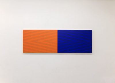
CUAC’s current exhibitions feature works that use stark lines and color in a minimalist way. This approach highlights the dynamics and textures that arise from things as simple as lines and shapes, making the viewer question their own perception of what they first think they see, and then they should interact with or try to understand it.
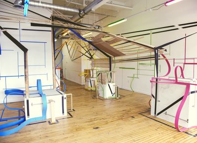
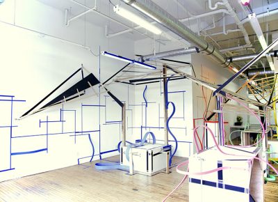
Get Used to It is the first piece one encounters upon entering the gallery. The installation explores the space of the first half of the gallery. It mimics the shape and features of the painted-over white pipes, conducts and cables, which are suspended in tangles from the ceiling. Creators Jared Steffensen and Christopher Kelly both have backgrounds in sculpture from the University of Utah, though 10 years apart. Steffensen works as the Curator of Exhibitions at UMOCA, while Kelly works as a set designer. It’s a maze of both angular, geometric and smooth, hill-like lines sprawling across the walls and floor. The lines come up and out of acrylic tape, carried on up and out of the wall by pliable wooden strips that squiggle into near-loops and empty hillocks that might be a reference to Steffensen’s interest in skateboarding.
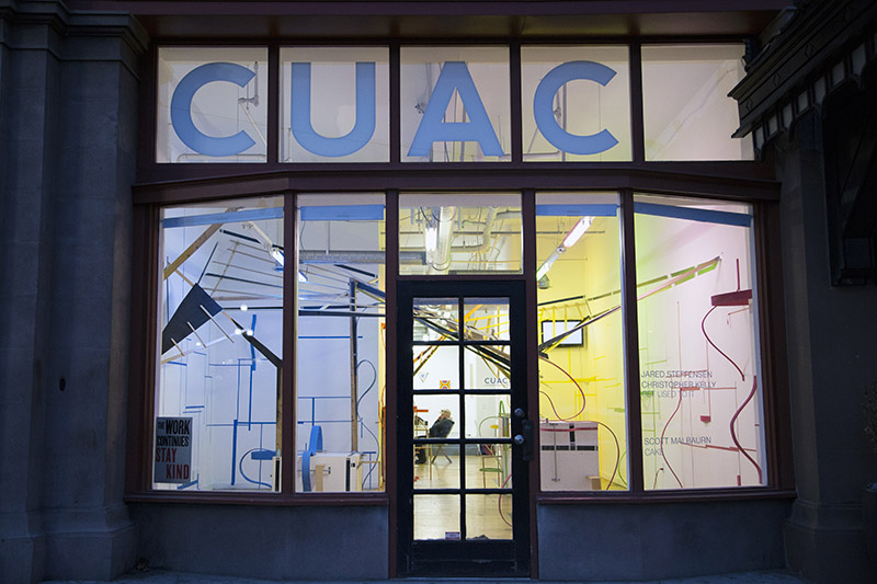
From the outside, you can see how all the three-dimensional lines look as a whole. Whether the artists intended this sort of perspective—or the interactive experience of ducking around those lines coming off the walls and pedestals—isn’t necessarily clear. However, whether viewers are simply looking in or actually exploring from beneath the skeletal plywood ceilings, the piece has a lot to offer the viewer. The title could refer to getting used to (and around) those thin strips of wood that curve out from the pedestals and the walls—without tripping. They follow the acrylic lines up toward the ceiling, where the strips, planks and boards of bare wood make a half-finished looking lean-to that stretches over the space and forms little eaves over the room’s corners, looking like the rickety ramps of the skateboarding world. The name might also refer to the staticky footage on one of the three monitors in the room, tucked up in a corner under an eave of pale wood, whose rippling pinkish static is actually ruined GoPro footage of an aerial of the Great Salt Lake. There’s absolutely no semblance of the lake in the murk of the static, but someone must have said, “Well, get used to it,” and decided to use it for our viewing pleasure anyways. What the other two TVs may have originally shown is a mystery, but still they add further dimension to the space. One’s fuzz is magnified by a bulbous glass over the screen, while the other is further blurried by the kind of glass you put in your bathroom to keep your naked body a secret from the neighbors.
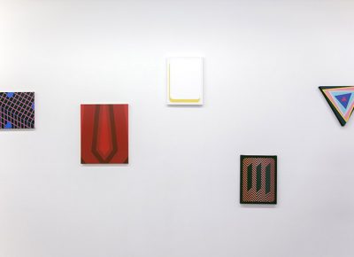
Once past this first area, the lines retreat to twisting in small spots of color on the bare white walls of the back portion of the gallery. Here we find the collection of Scott Malbaurn, titled Cake. Malbaurn is a Southern Oregon–based artist, whose work has been exhibited internationally. The paintings he has up on the walls in this portion of the gallery are on the smaller side. Most are made up of colorful acrylic lines and shapes that create, at times, dizzying geometric images. Initially, it is a relief after the chaos of the front gallery before one approaches the pieces and begins to try to figure out what’s going on in these brightly colored spaces on the wall.
These works are minimal and abstract and painstakingly sharp-edged, with names that complicate their starkness and lend them deeper possible meaning. Triangle: Let’s Be Honest is a duplicate piece, in a way. There are two different triangles with their own pieces, and both feature many other colorful triangles layered inside of them like nesting dolls, twisting and resisting alignment with the original in which they reside. The smallest, central triangle sits upright, sky blue in one and bubblegum pink in the other, and yet the tilts of the other triangles around it disrupt the reality or the truth of their uprightness. Open Folds: Black plays with the eye as the thinnest of lines suggest the shape of a prism-like star so faintly that it’s reminiscent of the way we construct lines between close stars in the sky, making constellations, or the way that certain stars grow fainter the harder you look at them. The Modular Chevron series also pry at the things that delicate touches can do. Two of them, the black and the white Modular Chevrons, are made up of lines of chevron, created by painting over some lines more heavily with the same exact color paint. This creates a sort of optical illusion, where it appears as though the chevrons were made with different shades of white or black, but in reality, their variance just comes with different layers of paint-coating.
Stop by CUAC to grapple with puzzles of color and line, both on the ground and in the air, but also on flat surfaces, in small, square realms of abstraction all their own. These two exhibitions are up until March 13, so be sure to pop in and see them before the next Gallery Stroll event.
