Juried Design: Rio Gallery’s Annual Design Arts Exhibit
Art
Rio Gallery’s Annual Design Arts Exhibit is the 17th in the gallery’s celebration of Utah designers. Each year, the exhibit highlights the art of good design from disciplines such as fashion, architecture, graphics and furniture. 16 artists are featured, and in the 2020 showing, and this year you can view the show digitally from Sept. 8–Oct. 16.
The Design Arts Exhibit highlights not just design but designers, whose work is selected for show by a single juror each year. This year, Jason Schupbach, the Director of the Design School at Arizona State University, has stepped in to choose 16 artists’ work from a pool of over 50 applicants including 16 students.
It can be easy for good design to go unnoticed or unappreciated, as much of the design we interact with day to day purposefully works within an established vocabulary that we’re accustomed to. The goal of much design may even be to go unnoticed, but this comes at the cost of appreciating the craft and the principles that make it work. “The exhibits have tried to be useful in demonstrating that good design doesn’t just happen,” says Jim Glenn, who oversees the Utah Division of Arts and Museums Design Arts Program. “The process is long and quite involved for a design to evolve to its final form.”

The Design Arts Exhibit highlights not just design but designers, whose work is selected for show by a single juror each year.
For the University of Utah’s Department of Theatre, Anna Oldroyd’s poster designs show grayscale photos of actors posing as characters from the 2019–20 run of plays—Macbeth, Floyd Collins, She Kills Monsters, to name a few. Oldroyd has overlaid a white sketch layer of props and costumes on top of the plain clothes actors, emphasizing performance within the poster itself. Although the actors hold no actual props or wear any costumes in these photos, the sketched element convinces us of the actors’ ability to assume a role: The act of performance is communicated from the first moment.
Design based around user interfaces and graphics is on display, too. Jamie Lancaster’s Project Mercury is a design-focused research project on how graphic design can help ALS patients navigate technology through eye-tracking. On its surface, the project resembles many productivity apps, but Project Mercury is specifically designed to work with the way visual stimulation engages people who are affected by these conditions to create an experience that works with the way they receive information.
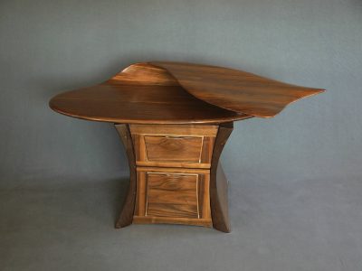
Design for physical objects and structures—such as architecture, furniture and spaces—tends to stand out as it is, but the pieces Schupbach has selected are particularly striking. Take, for example, David Delthony’s CLAM—a wood-finish table that folds in on itself like a piece of taffy, flattening a curled side to still function as a table but separated from both the rest of the table and traditional notion of a table. Part of what makes it a joy to look at is the impulse to touch the material, to tug on it as though it were as elastic as it seems. The wood aesthetic is at odds with its functional structure, but simultaneously feels clean and composed.

Design for physical objects and structures—such as architecture, furniture and spaces—tends to stand out as it is.
A cleverly literal play on the popular usage of the word “receipts,” Pisti Gamvroulas’ piece True Cost of Fast Fashion uses the motif of a receipt from a big-brand clothing store to list the atrocities caused by huge corporate fashion retailers such as H&M and Forever21. Deforestation, impact on agriculture, the rate of pollution and more are listed as costs on a giant receipt surrounded by the cheery branding of these companies’ totes and bags. Under “TOTAL:,” it reads: “Second to oil, the clothing and textile industry is the largest polluter in the world.” This entry won Gamvroulas the Juror’s Student Award.
The other Juror’s Student Award belongs to Bronwyn Haws, who created a series of event posters for the band Of Monsters and Men, focused on their Fever Dream tour. These images feature lead singer and guitarist Nanna Bryndís Hilmarsdóttir coming through a slipstream of pastels and mandelbrots. It communicates the haze of dreaming, filtered through a soft, welcoming aesthetic that retains a sense of otherworldliness.
Andrew Rease Shaw created the Juror’s Award winner, a modest-looking Hand-Printed Handkerchief. Printed on the muted-yellow cloth are shapes and lines that intersect in soothing ways—as crowded as the design is, each radiating circle and wave-like line interlocks, constantly leading the eye around the image but never letting it settle for too long before sending your attention across and back again. It’s quotidian and subtle, an inspired choice for Juror’s Award as a piece of design that engages the eye so deftly that it feels like it might never let go. Shaw’s piece typifies the quality in this exhibit: design that’s so well-crafted that it feels timeless.
You can see each of the described designs projects and more at utahvisualarts.omeka.net when it goes live on Sept. 8, and while it’s scheduled to run until Oct. 16, it may run longer given this year’s digital exhibition.
