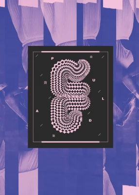
Looking Sharp: Annie Hall’s Cover Design of Occam’s Razor
Art
While many of us may not be familiar with the terms and rules commonly used in design, we have all undoubtedly seen a variety of these principles in action. Annie Hall, a senior designer at Bartlett Brands and overall artistic badass, has taken up the challenge to represent Occam’s Razor, a core principle of design that prioritizes simplicity, in an illustration on the cover of SLUG’s 2023 Design in Utah issue.
With a background in photography and graphic design, Hall was well-equipped for the task. After getting her start in graphic design as an editor for her high school’s yearbook, Hall started her own freelance graphic design business in college alongside her photography work. “Design just kind of came naturally,” she says. Hall began designing posters and magazine spreads, experimenting with different styles and subject matter. “My mom would label them as weird,” she says, “but they were funky graphic layouts that were really fun. I was able to create this really distinct look.”

“It’s about eliminating obstacles and streamlining an experience to be more efficient. You’re not there to distract or confuse a user.”
As her freelance design business gained traction, Hall dove into product and branding design as well as user experience (UX) design. “Overall, as a designer, I love doing a little bit of everything versus being specialized in one specific area,” Hall says. This passion for many types of design has given Hall the opportunity to refine and adapt her creative processes to a variety of markets and audiences. With each design, Hall finds a balance between adhering to branding parameters for each company while adapting to the conventions for different mediums.
Although many aspects of design are determined by individual companies’ branding standards, Hall gravitates toward designs with bold, bright colors and graphics that pop. “I love color. Anytime I have to do something in black-and-white, it kind of kills me,” she says. Her signature style, which Hall describes as “energetic … and slightly retro” can be seen in her illustration of Occam’s Razor on the cover of this month’s issue. For those of us who are less familiar with the concept of Occam’s Razor, Hall describes it as “taking two hypothetical conclusions and picking the most simple one. It’s about eliminating obstacles and streamlining an experience to be more efficient. You’re not there to distract or confuse a user.”
“If you’ve seen graphics for Occam’s Razor, it’s usually a single circle. I was like, ‘I can’t just do that. I’ve got to add depth, I’ve got to add color.’”
As is her goal with other design work, Hall integrates her bold, colorful style into the cover design while still preserving the core concept of Occam’s Razor. She says, “If you’ve seen graphics for Occam’s Razor, it’s usually a single circle. I was like, ‘I can’t just do that. I’ve got to add depth, I’ve got to add color.’” Along with her goal to incorporate her individual style and aesthetic into her design of Occam’s Razor, Hall also set out to create an illustration that represents the meaning of the principle. “Obstacles are blurred,” Hall says, “reflecting the thought that complex ideas can often blur the lines of what the user actually needs. In the end, a simplified idea or conclusion is clearly visible. We’re blurring the lines—or, an object like you see on the cover—when we add in all these complex items that we don’t necessarily need in a design.”

Occam’s Razor is just one of the concepts that designers like Hall consider throughout their creative processes. “The biggest thing in the process really is the branding,” she says. “You want to be able to know, ‘what does this brand look like? What does it encapsulate?’” While these questions might be answered through one process for a three-dimensional product design, Hall adapts her process for digital mediums such as website design. “We’re thinking about the experience of someone opening [a package], or seeing the package from five feet, 10 feet, 15 feet away. For web, we think about the experience of someone coming to the website.”
“Overall, as a designer, I love doing a little bit of everything versus being specialized in one specific area.”
Throughout her graphic design journey, Hall has drawn inspiration from many local designers and artists, including one of Hall’s college professors Chuck Landvatter, local tattoo artist Gailon Justus and multidisciplinary artist Jill De Haan. “All of their work is just amazing,” Hall says. “They’ve all been really influential for me.”
To connect with Hall and see more of her work, find her on Instagram @anniehall.co and visit anniehall.co.
Read more cover artist features:
Ashley Love Loves her Craft
Ann Chen: Writing History in her Own Script
